Less is more
TYPOGRAPHY
To create a modular typography inspired by the architect Ludwig Mies Van der Rohe, his vision of design and his values. His work is based on the balance between minimalism and functionality, with an approach in which each element is designed to be both uncluttered and structured.
Artist's moodboard
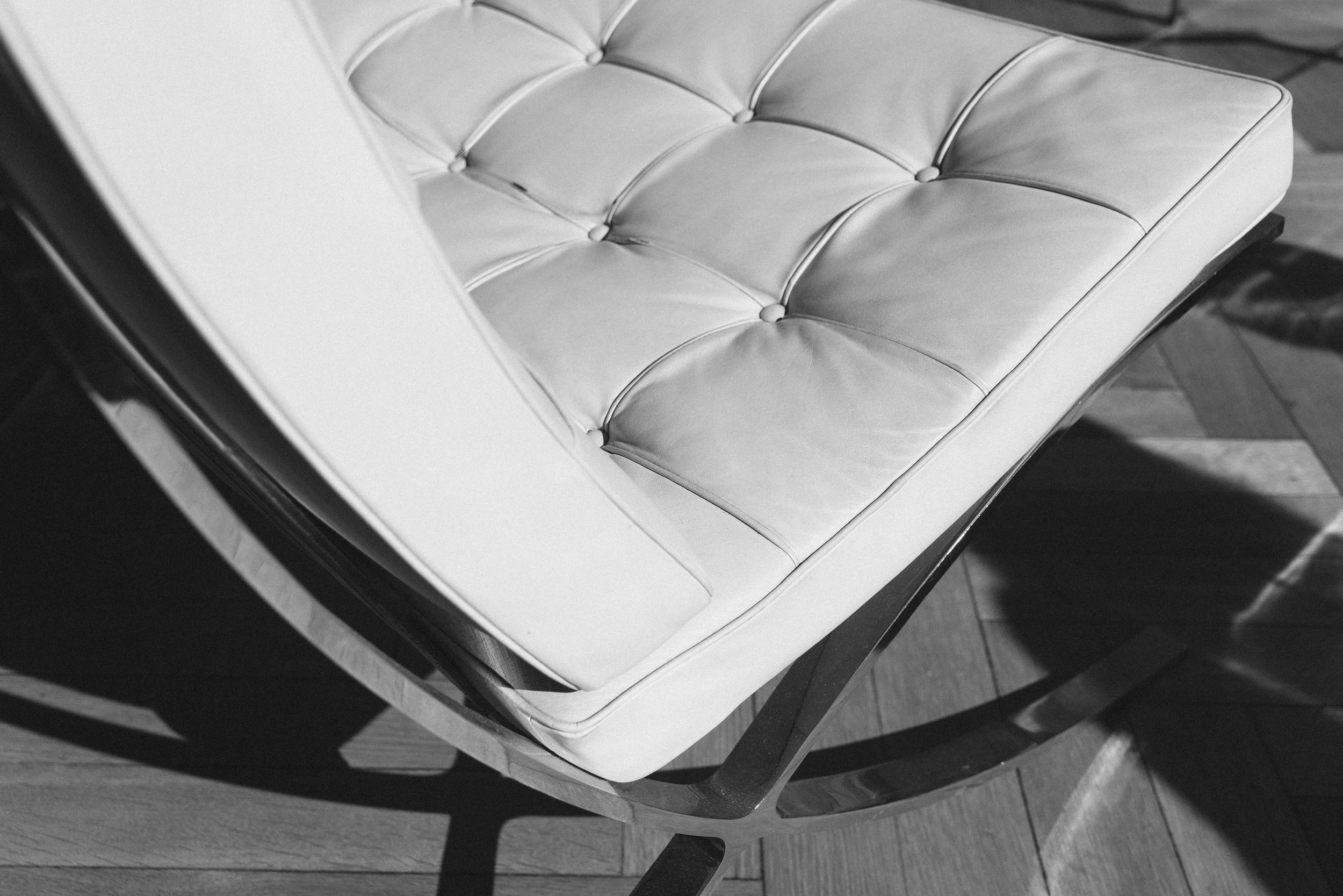
Observing his architectural and furniture creations, I sought to transpose his visual language into typography. The idea was to play with simple shapes that could generate a wide variety of letters and compositions, following the “Less is More” principle.

Research phase


Sketches & Modules
Each typeface is based on a modular structure, inspired in particular by the curves and materials of its iconic furniture, such as the metal VDR_20 chair. This approach results in a versatile typography, where a single module can give rise to several letters and variations.

Sketch

Modules

Letter construction
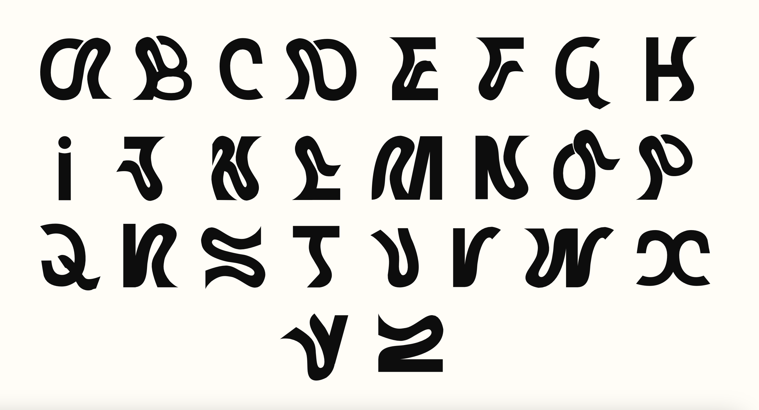
Final alphabet

